Tuesday, May 8, 2012

Assignment 20 Research and Inspiration

Shepard Fairey
  • Contemporary artist who emerged from the skateboarding scene. Now typically known as a street artist.
  • Known for the "Andre the Giant Has a Posse" sticker campaign. Also the Obama "Hope" poster.
  • Fairey has been involved in controversy over fair use and copyrights. This controversy has proved him to be a little hypocritical in that he sued another artist for using his work, yet has been accused of doing the same himself.

Education
  • Education should be available to all types of people: race, gender, nationality,  ethnicity, etc.
  • Associations: school bus, books, backpack, pencil, notebook, computer?, apple.
  • Color: red and orange - stimulating, yellow - cheery, blue and green - calming. Young children - whites and creams to promote calm with bright accents to appeal to children's energy. Teenagers - reject neutral colors and opt for blues and greens. Variety of color is important.
I like this poster for the emotion of the child and the job title text.
I like the headline, however there is too much variation in color in the text.
I love the message and design of this poster. I love the typography and how all of the colors of the text coordinate well. It has a nice visual organization as well.


Wednesday, April 25, 2012

Assignment 19 Research and Inspiration

Trends
  • Die cut cards, photographs, vertical orientation, textured, foil accents, folded cards, plastic cards, simplicity, double sided cards. Red makes the viewer hungry.
Visual Hierarchy
  • Logo, name, title, web and email address, address, phone and fax.
Competition


Business Card Inspiration

Overall, from the competition pieces, I like the incorporation of candy and bright colors.

I love that this card has an interesting shape that also relates to the business.

I like the texture and that the background is split and has an interesting design.

I like the shape and simplicity of this card.

Letterhead Inspiration


I really like the border of the letterhead. I don't like the envelope as much.


I like the brightness of this letterhead, I feel that mine should be bright as well. I think that the logo and company information take up too much room though.


I really like the border at the top and how the company name works with the design.

Envelope Inspiration


I like how this envelope coordinates with the other pieces, while having its own design.


I like how decorative this envelope is, but I think that it is too dark on the right side of the envelope.


Tuesday, April 24, 2012

Stationery Package

Stationary Package is the printed pieces that a company utilizes for communication purposes.
  • When establishing a business, it is important that all communications are well coordinated and the message of the organization is presented consistently. 
  • Basic package includes business card, letterhead, and envelope.
Business Card
  • Small but essential. It gives the viewer an immediate opinion about the company. It shows the company's mission, culture, and goals. Color, font, texture, shade, and gloss of the paper all say something about the company.
  • Typically includes logo, company name, employee name, business title, phone number, fax number, email address, company address, and web address.
  • Must be 2"x3.5", horizontal or vertical orientation, typical margin is .25" to .125", check for accuracy, check for unity and continuity among other pieces.
Letterhead
  • A printed piece of paper used to send letters, memos, etc.
  •  Typically includes logo, company name, company address, phone and fax number, and web address.
  • Must be 8.5"x11", vertical orientation, space to write on the middle of the page, .25" margins, check for accuracy, and check for unity and continuity among other pieces.
Envelope
  • The packaging that contains the letter/form when being mailed. Standard #10 envelope.
  • Typically includes logo, company name, and company address in top left corner.
  • Must be 9.5"x4.125", horizontal or vertical orientation, room for recipient's address and stamp, margins typically .25", check for accuracy, and check for unity and continuity among other pieces.

Thursday, April 19, 2012

Assignment 18 Research and Inspiration

A wordmark logo utilizes the company name in a styled font.

I like the contrast within the color and thick and thin words in this logo.
 I like the subtle contrast between these words and the understated "media."
I like the figure ground use of the male symbol and the "O."
If I choose the In Focus Photography company name, I think the blurred letters would be interesting.


Friday, April 13, 2012

Assignment 17 Research and Inspiration

Current trends:
  • Unusual Shapes
  • Buttons and Bubbles
  • Sleek, lightweight fonts
  • Grays and browns replacing black
  • Greens and earth tones
Inspiration

I like the figure ground use of the objects in the boxes in the title of the packaging.


I like the figure ground combination of the 'f' and 'l' with the wine bottle in between.

Competition


Thursday, April 12, 2012

Logotypes

Prezi Notes
  • A logotype is a graphic mark or emblem commonly used by commercial enterprises, organizations and even individuals to aid and promote instant recognition.
  • With the industrial revolution of the 18th and 19th centuries, there was a boom in advertising industries using typography and imagery on a page. As well, arts were expanding from expression and decoration to differentiation of brands and products.
  • With the 1950s, Modernism left its purpose as an artistic movement in Europe to become a commercialized movement in the United States.
  • Modernist logos were successful in the era of mass visual communications.
  • Logo designs are difficult to perfect because they are meant to bring immediate consumer recognition.
  • When it comes to logos, less is more because the average person doesn't spend time looking at and analyzing them.
  • A logo needs to be simple but able to stand out.
Principles for Effective Logo Design
  • Simple: Simplicity makes a logo design recognizable. Good logos feature something unexpected or unique without being "overdrawn."
  • Memorable: An effective logo design should be memorable which is achieved by keeping it simple yet appropriate.
  • Timeless: An effective logo should be able to stand the test of time and stay effective in 10, 20, or 5o years.
  • Versatile: An effective logo works across a variety of media and applications. Because of this, they should be created in vector format to ensure scaling to any size. Beginning to design in black and white allows the designer to focus on the concept and shape.
  • Appropriate: The logo should be appropriate for the intended audience.
Color
  • Four color process is a technique for printing with full color. The four colors reproduce all colors of the spectrum. CMYK - cyan, magenta, yellow, black.
  • Spot color is a method of specifying and printing colors in which each color is printed with its own ink. This printing method is effective when the printing matter contains one to three colors.
  • Pantone matching system is created by a company that is a numbered system of colors that relate to a specific color that are the same worldwide.
  • Color plays an important role in logo design, they can illicit different feelings and emotions from the audience. Interpretation of color may vary depending on age, gender, and cultural demographics.
  • Colors tend to follow trends. New, vibrant companies may want to follow current trends while banks may want to stay with a more conservative color palette. Keep color palette to two or three. Too many can increase cost of production and create a chaotic design.
Combination Mark: graphics with both text and a symbol/icon that signifies a brand image.

Iconic/Symbolic: The use of imagery to convey a literal or abstract representation of an organizations. They are less direct than straight text to leave room for a broader interpretation.

Wordmark: Utilizing the company name or initials into a styled type font treatment.

Thursday, March 15, 2012

Assignment 16 Research and Inspiration

Research
History of Visual Communications podcasts are already on blog.
Infographics are quick visual representations of information and data.

Inspiration
Some sort of line that travels through the page, connecting each event.
Darker from beginning of the history getting lighter and brighter with the chronology of each event.

Friday, March 9, 2012

Early Computers | 1930s - 1980s AD

What is an abacus? A device able to perform simple math calculations.

In 1936, Zuse invented this type of computer? Freely programmable.

Post a photo of the 1944 Mark Computer.


In 1944, Aiken and Hopper designed the Mark Series of computers to be used for what? By the US Navy for gunnery and ballistic calculations.

Post a photo of the UNIVAC Computer.


In 1951, Eckert and Mauchly designed the first commercial computer for whom?
The Census Bureau.

What does UNIVAC stand for?
Universal Automatic Computer.

In 1953, IBM enters the scene. What does IBM stand for? International business machines.

What is FORTRAN?
The IBM mathematical formula translating system.

Post a photo of the first mouse.


In 1964, how did Engelbart change the way computers worked? By making them a more user-friendly tool.

What is the significance of ARPnet?
The first internet - Advanced Research Projects Agency Network.

In 1971, Intel introduced this?
Post a photo of it. The first single chip microprocessor, the intel 4004
In the same year, IBM introduced this? Post a photo of one. The first memory disk commonly called the floppy disk.
In 1973, Metcalf and Xerox created this? The first ethernet computer network.

During the next several years, the first consumer computers were marketed.
Post photos of the Altair, Apple I, Apple II, TRS-80, Commodore PET. Label each.


Altair


Apple I
Apple II
TRS-80


Commodore PET

In 1981, Bill Gates and Microsoft introduced this package?
The MS_DOS computer operating system which was packaged with the IBM PC.

Post a photo of the Lisa computer.

In 1983, who introduced the Lisa computer? Xerox corporation.

What is GUI?
Graphical user interface.

Post a photo of the computer mentioned below.
In 1984, a more affordable home computer was introduced. Name the computer and the company that marketed it? The Apple Macintosh computer.

The commercial only ran one time. When?
The 1984 superbowl, January 22, 1984.

In response to the Apple GUI, Gates and Microsoft introduced this?
The Windows Operating system.

Two men are known for their development of the Apple I computer. Who are they?
Steve Wozniak and Steve Jobs.

When was the internet that we know, world wide web, developed and introduced?
1990.

Over the years, Apple has included "easter eggs" within their software. What is an "easter egg"?
An easter egg is a hidden meaning for users to discover.

Search for easter eggs in Photoshop and Illustrator. List a few in this post ... and try to find them in the applications.
1. With photoshop running go to apple menu
2. Hold option key and pull down to about photoshop
3. You get beta splash screen
4. hold command key and click cat's nose
5. Belch!!

Where do you think computers will take us in the next 10 years?
Computers will and already are revolutionizing the way that humans receive, give, and spread information. Computers will be used more frequently in schools and large companies will use more technology and programs on a daily basis.

Photography | 1839 - 1960s AD

Until the 1880s, how were news stories illustrated? From engravings or woodcuts.

What is a camera obscura? An optical device that projects an image of its surroundings onto a screen.

Post an example of a camera obscura.

How did scholars and artists utilize the camera obscure? A way to observe light.

From where did the photographic camera develop? The portable box.

Who first used the term "photography"? Where was is derived from? Sir John Hershel - the Greek words for light and writing.

Post an the first photograph.

Who is credited with making the first successful photograph? Joseph Niepce.

Post an example of a Daguerreotype image.

Who invented the Daguerreotype process? What are the advantages and disadvantages of the process? Louis Daguerre. The exposure time was reduced but it was expensive and the images couldn't be duplicated.

Post an example of a Calotype image.

Who invented the Calotype process? What are the advantages and disadvantages of the process? William Fox Talbot. The quality was inferior to Dauerreotype. An unlimited amount of duplicates can be made.

Post an example of a Wet Collodion Process image.

Who invented the Wet Collodion process? What are the advantages and disadvantages of the process? Frederick Scott Archer. Reduced exposure time and inexpensive. Inconvenient.

Post an example of a Dry Plate Process image.

Who invented the Dry Plate process? What are the advantages and disadvantages of the process? Richard Maddox. Simpler yet too complex for the public.

Who is George Eastman? Made photography accessible to all.

What company did he establish? The Eastman Kodak Company.

Post an example of The Kodak Camera from 1888.

In 1888, he produced a camera that use his flexible roll film. How did he make this camera/photography accessible to the public? He sold a camera for only $1.

What is Edwin Land best known for? What company did he establish? Patenting polarized light filters and the invention of instant photography. The Polaroid Corporation.

Post a photo of the first Polaroid camera.

How long did the first Polaroid camera take to produce a photo? 60 seconds.

What was Eadweard Muybridge known for? Using multiple cameras to capture motion.

Post a photo of the Zoopraxiscope.

What is the Zoopraxiscope? A device used to project a series of images in successive phases of motion.

Post a photo of Muybridge's horse in motion.


How did Muybridge settle the debate and photograph a horse in motion? Muybridge place cameras at intervals that would be triggered by a thread as the horse passed by.

In 1880s, the development of the motion picture camera allowed this? Individual images to be captured and stored on a single film reel.

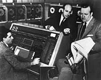
Post a photo of a motion picture projector.

What is a motion picture projector? A light shines through the film and magnifies the moving picture onto a screen for an audience.