Wednesday, April 25, 2012

Assignment 19 Research and Inspiration

Trends
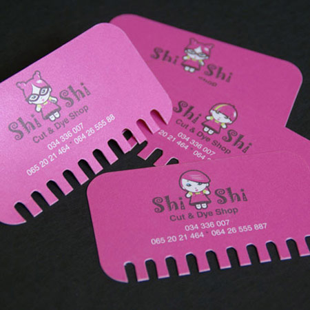
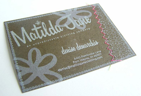
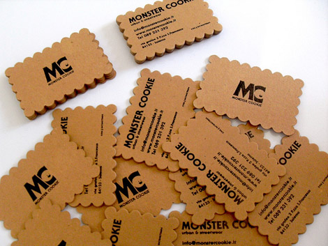
  • Die cut cards, photographs, vertical orientation, textured, foil accents, folded cards, plastic cards, simplicity, double sided cards. Red makes the viewer hungry.
Visual Hierarchy
  • Logo, name, title, web and email address, address, phone and fax.
Competition


Business Card Inspiration

Overall, from the competition pieces, I like the incorporation of candy and bright colors.

I love that this card has an interesting shape that also relates to the business.

I like the texture and that the background is split and has an interesting design.

I like the shape and simplicity of this card.

Letterhead Inspiration


I really like the border of the letterhead. I don't like the envelope as much.


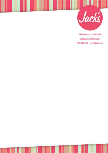
I like the brightness of this letterhead, I feel that mine should be bright as well. I think that the logo and company information take up too much room though.


I really like the border at the top and how the company name works with the design.

Envelope Inspiration


I like how this envelope coordinates with the other pieces, while having its own design.


I like how decorative this envelope is, but I think that it is too dark on the right side of the envelope.


Tuesday, April 24, 2012

Stationery Package

Stationary Package is the printed pieces that a company utilizes for communication purposes.
  • When establishing a business, it is important that all communications are well coordinated and the message of the organization is presented consistently. 
  • Basic package includes business card, letterhead, and envelope.
Business Card
  • Small but essential. It gives the viewer an immediate opinion about the company. It shows the company's mission, culture, and goals. Color, font, texture, shade, and gloss of the paper all say something about the company.
  • Typically includes logo, company name, employee name, business title, phone number, fax number, email address, company address, and web address.
  • Must be 2"x3.5", horizontal or vertical orientation, typical margin is .25" to .125", check for accuracy, check for unity and continuity among other pieces.
Letterhead
  • A printed piece of paper used to send letters, memos, etc.
  •  Typically includes logo, company name, company address, phone and fax number, and web address.
  • Must be 8.5"x11", vertical orientation, space to write on the middle of the page, .25" margins, check for accuracy, and check for unity and continuity among other pieces.
Envelope
  • The packaging that contains the letter/form when being mailed. Standard #10 envelope.
  • Typically includes logo, company name, and company address in top left corner.
  • Must be 9.5"x4.125", horizontal or vertical orientation, room for recipient's address and stamp, margins typically .25", check for accuracy, and check for unity and continuity among other pieces.

Thursday, April 19, 2012

Assignment 18 Research and Inspiration

A wordmark logo utilizes the company name in a styled font.

I like the contrast within the color and thick and thin words in this logo.
 I like the subtle contrast between these words and the understated "media."
I like the figure ground use of the male symbol and the "O."
If I choose the In Focus Photography company name, I think the blurred letters would be interesting.


Friday, April 13, 2012

Assignment 17 Research and Inspiration

Current trends:
  • Unusual Shapes
  • Buttons and Bubbles
  • Sleek, lightweight fonts
  • Grays and browns replacing black
  • Greens and earth tones
Inspiration

I like the figure ground use of the objects in the boxes in the title of the packaging.


I like the figure ground combination of the 'f' and 'l' with the wine bottle in between.

Competition


Thursday, April 12, 2012

Logotypes

Prezi Notes
  • A logotype is a graphic mark or emblem commonly used by commercial enterprises, organizations and even individuals to aid and promote instant recognition.
  • With the industrial revolution of the 18th and 19th centuries, there was a boom in advertising industries using typography and imagery on a page. As well, arts were expanding from expression and decoration to differentiation of brands and products.
  • With the 1950s, Modernism left its purpose as an artistic movement in Europe to become a commercialized movement in the United States.
  • Modernist logos were successful in the era of mass visual communications.
  • Logo designs are difficult to perfect because they are meant to bring immediate consumer recognition.
  • When it comes to logos, less is more because the average person doesn't spend time looking at and analyzing them.
  • A logo needs to be simple but able to stand out.
Principles for Effective Logo Design
  • Simple: Simplicity makes a logo design recognizable. Good logos feature something unexpected or unique without being "overdrawn."
  • Memorable: An effective logo design should be memorable which is achieved by keeping it simple yet appropriate.
  • Timeless: An effective logo should be able to stand the test of time and stay effective in 10, 20, or 5o years.
  • Versatile: An effective logo works across a variety of media and applications. Because of this, they should be created in vector format to ensure scaling to any size. Beginning to design in black and white allows the designer to focus on the concept and shape.
  • Appropriate: The logo should be appropriate for the intended audience.
Color
  • Four color process is a technique for printing with full color. The four colors reproduce all colors of the spectrum. CMYK - cyan, magenta, yellow, black.
  • Spot color is a method of specifying and printing colors in which each color is printed with its own ink. This printing method is effective when the printing matter contains one to three colors.
  • Pantone matching system is created by a company that is a numbered system of colors that relate to a specific color that are the same worldwide.
  • Color plays an important role in logo design, they can illicit different feelings and emotions from the audience. Interpretation of color may vary depending on age, gender, and cultural demographics.
  • Colors tend to follow trends. New, vibrant companies may want to follow current trends while banks may want to stay with a more conservative color palette. Keep color palette to two or three. Too many can increase cost of production and create a chaotic design.
Combination Mark: graphics with both text and a symbol/icon that signifies a brand image.

Iconic/Symbolic: The use of imagery to convey a literal or abstract representation of an organizations. They are less direct than straight text to leave room for a broader interpretation.

Wordmark: Utilizing the company name or initials into a styled type font treatment.